Visuals
Navigation bar
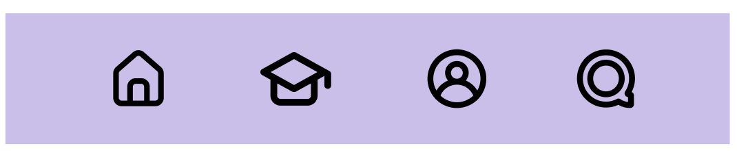
Our bottom navigation bar features four main icons, each leading to one of the app's primary pages. By default, the icons appear in gray, but the icon corresponding to the currently selected page will be highlighted in black.
Home icon
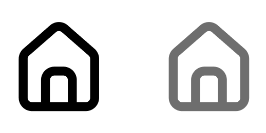
This Icon will direct user to the Home page where user can see the top subjects and navigate to the
Goal icon
This Icon will navigate users to the page where they can find new subject based on there preferences. Users can set a goal with Oscar.
Profile icon
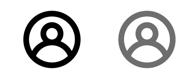
This icon is connected to the profile page where user can track their goals and achievement. User can access to the setting page through the profile page.
Quiz icon
This icon will be linked to the Quiz page where the use can test how much they have learnt from the course they took.
Components
Card
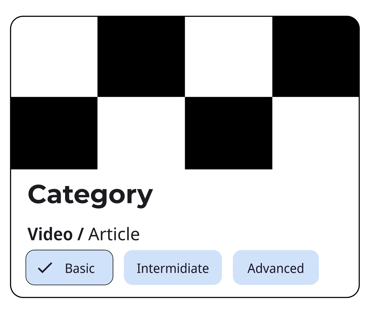
The Card with chips will display categories or tags, allowing users to quickly see which categories an item belongs to or to filter items by category.
Cards organize content in a clear, digestible manner, making it easier for users to find information, since they break down complex information into manageable chunks.
Carousel
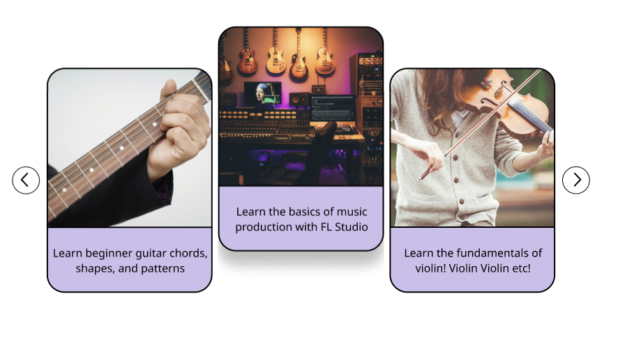
The selected carousel will feature a dropdown shadow, creating a lifted effect that visually indicates the active selection from a user interaction standpoint.
Dialogue
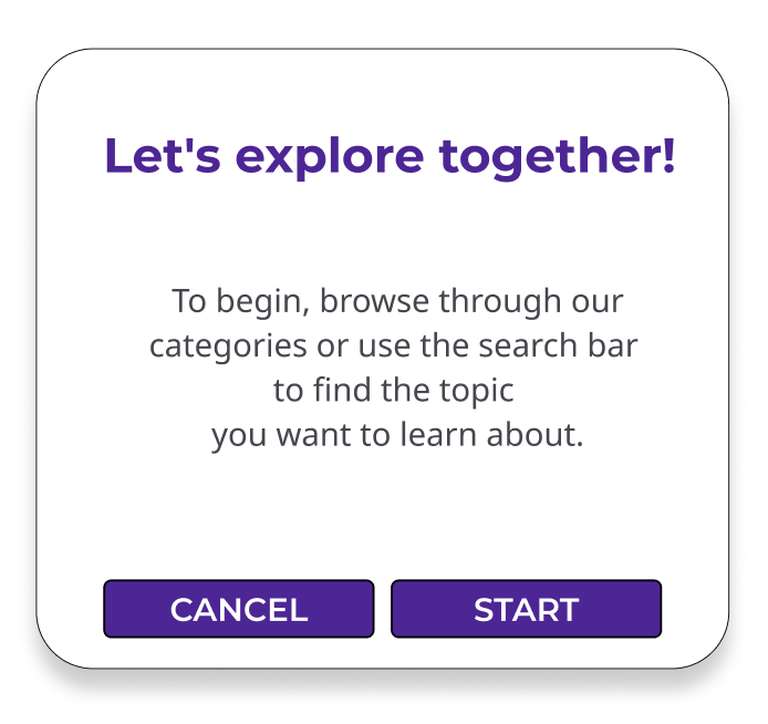
This icon is connected to the profile page where user can track their goals and achievement. User can access to the setting page through the profile page.