Our app's typography is built on two primary typefaces: Montserrat and Noto Sans.
Montserrat is used for headings to capture attention with its geometric elegance and modern flair, while Noto Sans is employed for body text, ensuring readability and comfort for extended reading. This combination provides a balanced visual hierarchy, enhancing the user experience through clear and consistent typography.
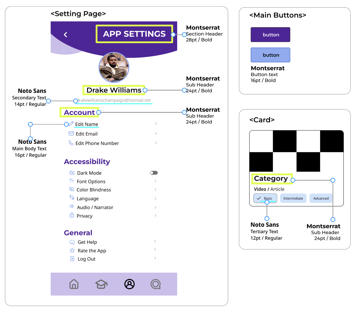
Montserrat
Reasoning
Montserrat offers a geometric, clean aesthetic that's great for headings and stand-out text, giving the app a modern and uncluttered look.
Text Examples
-
Large Titles(34pt)
Use for main page titles or important headers to grab attention.
-
Section Headers(28pt)
Use for section titles within a page to clearly differentiate parts of your app's content.
Sub-Headers(24pt)
Suitable for sub-section titles or important information that needs to stand out just below the section headers.
Buttons(16pt)
Suitable for sub-section titles or important information that needs to stand out just below the section headers.
Noto Sans
Reasoning
Noto Sans is versatile for body text, ensuring readability and accessibility, with its aim of supporting all languages with a harmonious look and feel.
Text Examples
-
Main Body Text(16pt)
Ensuring readability for most users by using the standard size for body text.
-
Secondary Text(14pt)
Use for less important information, captions, or as a secondary level of information hierarchy.
Tertiary or Hint Text(12pt)
Use for form field labels, hints, or any tertiary information that is not a primary focus.
Examples