Colour Selection
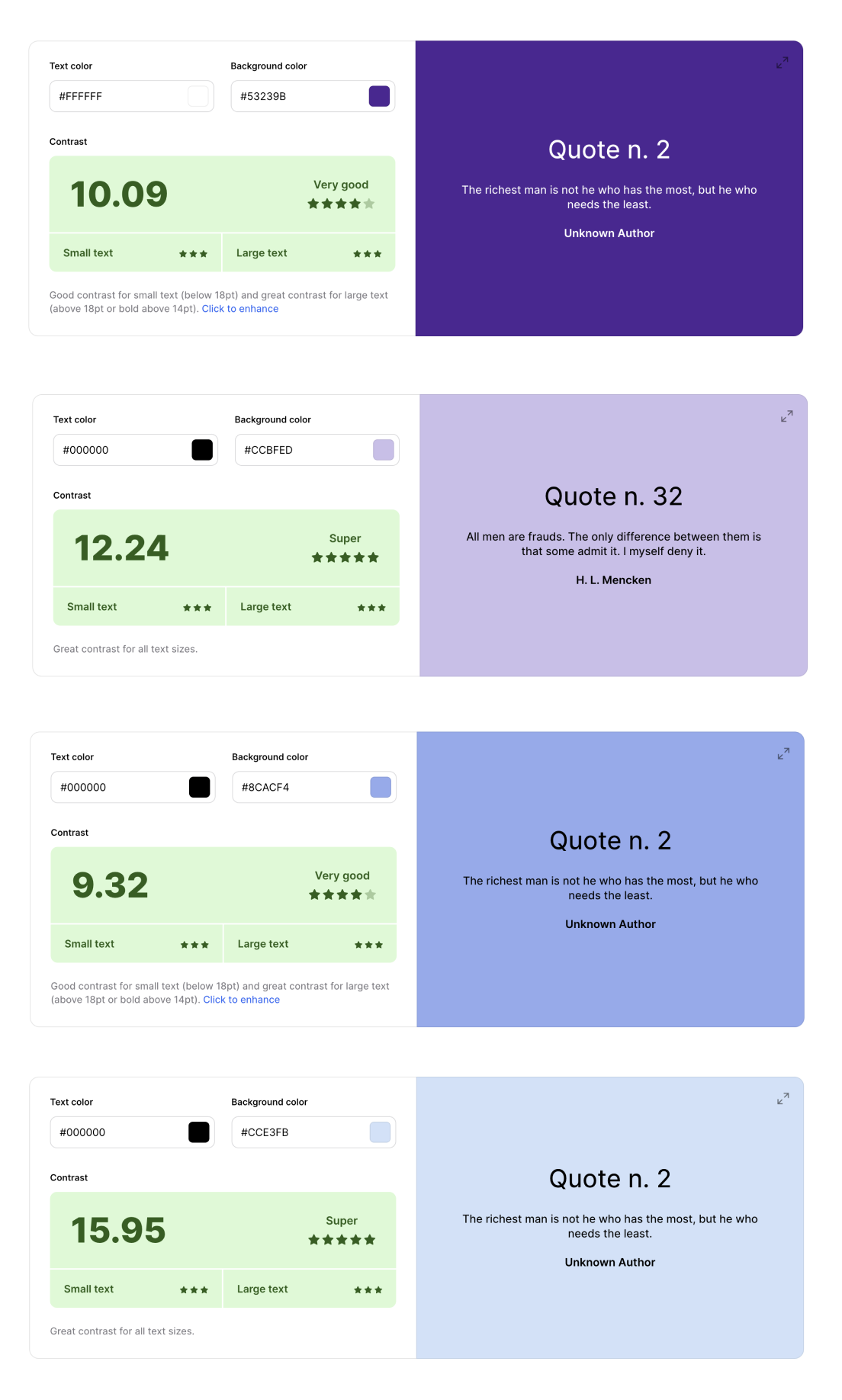
Primary color - Purple
The color #53239B, a Purple, embodying the qualities of wisdom, creativity, and introspection. This choice can help users maintain focus and calmness, making complex or challenging topics more approachable reflecting the intellectual and imaginative aspects of learning.
Tertiary color - Light Violet
The connection between the primary color (Purple), this teritory color makes a visually cohesive environment with its lighter quality. It is particularly effective in background areas or less interactive sections of the app, where the goal is to provide information without overwhelming the user.
Secondary color - Calming Sky Blue
The color #8CACF4, a calming sky blue, evokes feelings of openness and tranquility.This color choice can contribute to reducing cognitive overload, create a harmonious gradient that can help to present the app as approachable and user-friendly.
Tertiary color - Light Azure
The relationship between the secondary color(Calming sky blue), a light azure is strategically complementary, enhancing the user interface's visual. While Calming Sky Blue is more stimulating and thus suited for interactive elements such as buttons, Light Azure creates spaces in the app reducing visual fatigue and helping to keep users engaged over longer periods without feeling overwhelmed.
Highlight color - Sunflower Yellow
#F9DF74, a sunflower yellow, provides energy and optimism into the app's design. This hue stands out against the cooler tones of the palette, drawing attention to essential elements such as achievements. The use of this colour can enhance user engagement by making key interactions motivating users to continue making progress.
Contrast Check